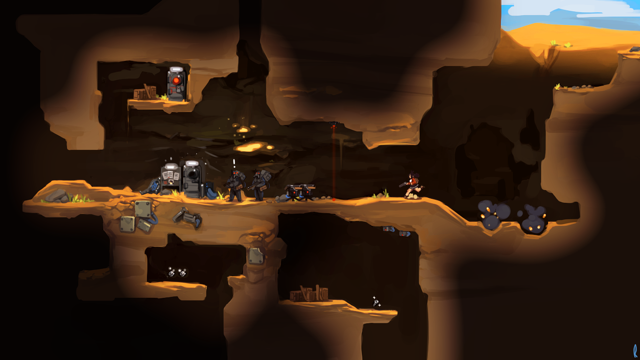
Hmm we need to get more art up on here, too much text! Here's a Mock-Up I did recently for Odonata's new format, check out the post over at Odonata's Devblog!
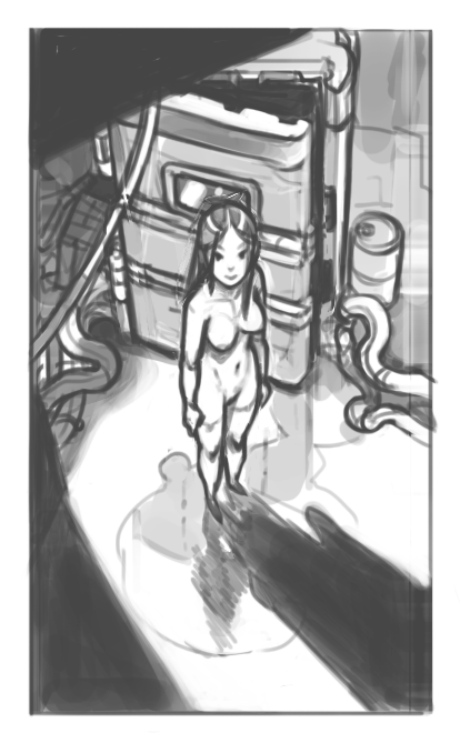
Annd, here is just a little mess about related to Odonata's story, still a work in progress, forgive me on the anatomy the perspective is kicking my ass!


4 comments:
color it!
Looking awesome both of those, can't wait to see more on the project. It's always and inspiration coming by here Mr.Laro! About the format I've had to switch myself couple of times with my small projects to the side scrolling one, just so much easier for many things even if I love isometric so much. And of course side scrolling allows for some awesome picaresque parallax backgrounds... and better use of gravity :), I got carried away..
Looking awesome, but don't let it become something like Terraria!
yayyy i miss your art Rob :)
Post a Comment